Application Properties
The Properties tab of the application provides access to various configuration options. These properties are listed on the left-hand side of the properties page and include the following categories:
Information Tabs: This section allows you to manage different sections of information within the application. You can organize and customize this tabs/information based on your needs.
Application Views: Here, you can define how the application is presented or displayed to users. It includes settings related to the user interface, layout, and visual representation of the application.
Roles and Permissions: In this category, you can assign roles and permissions to users or groups. It controls who has access to specific features or functionality within the application.
Other Settings: This section covers additional configuration options that don’t fall into the above categories. It may include settings related to notifications, integrations, or other specific behaviors of the application.
Let us look into each sections closely.
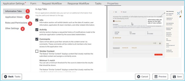
Information Tab
In the Information tab, you have the option to enable additional details relevant to the application. There are four checkboxes available:
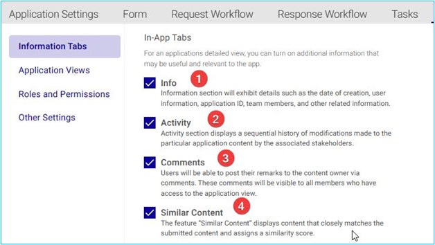
Info: This section provides details such as the creation date, user information, application ID, team members, and other related information.
Activity: Here, you’ll find a chronological history of modifications made to the specific application content by various stakeholders.
Comments: Users can post remarks to the content owner via comments. These comments are visible to all members who have access to the application view.
Similar Content: This feature displays content closely matching the submitted content and assigns a similarity score.
When using the “Similar Content” feature, you have the option to set a minimum threshold for the similarity score. By doing so, you can filter the results and only display content that meets or exceeds your specified percentage match. This ensures that you receive relevant and closely related information.
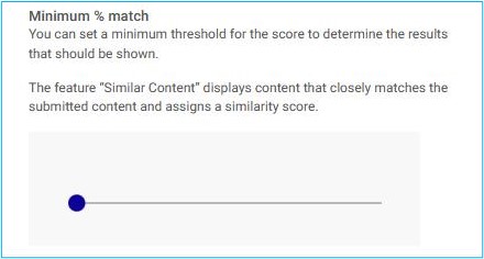
Feel free to adjust the threshold according to your preferences, and explore the content that aligns most closely with your submitted material.
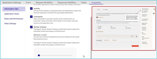
On the right-hand side of the page, you can see the preview of the information tab. The preview shows the position of the information tabs.
Application Views:
In Application Views tab, you have the option to change how your applications landing page looks by picking from different view options. Depending on your preference, you can show your content in a Grid View, which arranges your applications in rows and columns, or a List View, which shows your applications one below the other. You can also use both views or none at all.
Card View
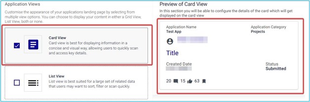
If you want to present information in a way that is easy to read and understand, you should use card view. Card view is a design pattern that shows information in small, rectangular cards that have a clear and consistent layout.
Each card can contain elements like Application Name, Application category, Creator’s name and Profile picture, created date, Status of the application and number of Comments and likes or ratings. Card view is ideal for displaying information that has different levels of importance or relevance, because users can quickly scan the cards and focus on the ones that interest them. Card view also makes the information more attractive and engaging, because it uses visual cues and hierarchy to highlight the key details.
List View
When users need to access and compare a lot of data that belongs to the same category, list view is an ideal option. List view displays data in rows and columns, allowing users to sort and filter the data according to different criteria. List view also enables users to scan the data quickly and efficiently, as they can see multiple items at once and focus on the most relevant information. List view is especially useful for complex or dynamic data sets that require frequent updates or changes.
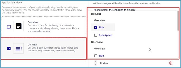
One of the features of aapli is that you can customize the way you view the Applications. On the right-hand side of the page, you will see a dropdown menu that lets you choose which columns you want to see. You can select from the following options: Title, Description, Comments, Followers, Likes, Profile Picture, Created By, Created Date, and Status. These columns will show you different information about each Application, such as the title of the Application, a brief summary of its content, the number of comments it has received, the number of people who follow it, the number of likes it has earned, the profile picture of the Creator, the name of the Creator, the date when the post was created, and the current status of the post (e.g., Submitted, Approved etc.).
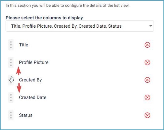
Once the columns are selected for list view, we can interchange their positions by dragging their position as shown in above image.
Roles and Permission
One of the features of an application is the ability to assign different roles and permissions to users. This means that users can have different levels of access and control over the application’s functions and data, depending on their role. For example, an administrator role might have full access to all the settings and features of the application, while a user role might have limited access to only view some data. Roles and permissions can help to manage the security and privacy of the application, as well as to customize the user experience based on their needs and preferences.
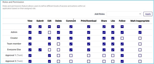
We can add roles using the Add Role drop down list and thus we can assign different permissions using the respective checkboxes under each properties.
Other Settings
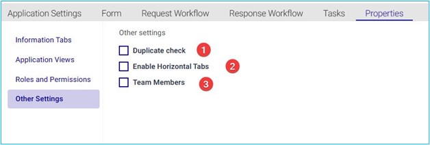
- Duplicate Check: This option allows you to determine whether you want to check for duplicate application or entries. When enabled, the system will compare new content with existing content to identify any duplicates. It’s a useful feature to maintain data integrity and avoid redundancy.
- Enable Horizontal Tabs: By selecting this checkbox, you enable horizontal tabs within the application view. Horizontal tabs organize content side by side, making it easier to navigate and access different sections or features.
- Team Members: This checkbox relates to team collaboration. When checked, it indicates that team members associated with the application can access and collaborate on the application. It ensures that relevant stakeholders have the necessary permissions to contribute and work together effectively. One can configure these settings according to your preferences and requirements!
Application Category The application category feature allows users to create and define categories in which applications can be created. This feature helps in configuring application categories so that applications can be organized and managed more efficiently.