Form Builder:
The middle pane in form is where we construct the form by creating sections, dragging and dropping the necessary components. Additionally, on the right-hand side of the page, we can add details of the components that we have selected.
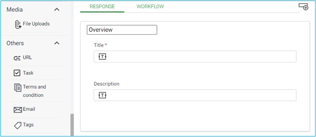
The middle section of the form editor has two default tabs labeled “Response” and “Workflow”, and we have the option to add additional tabs based on our requirements.
When the form tab is opened, the middle section defaults to displaying the “Response” tab, which already includes a pre-existing section called “Overview” (The name of the section can edited using the general section on the right hand side pane). This section contains two single-line input fields for entering a title and description.
Tabs: When forms tab is opened, “Response” and “Workflow” tabs will be created by default and we can also create and add more tabs as per applications requirement.
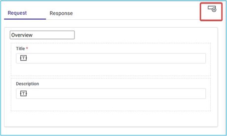
Adding a New Tab: Based on the requirements of the application we can also add additional tabs in the form. To add tabs in the form, we can click on new tab icon as show below, and this will create a new tab.
Renaming a Form Tab:
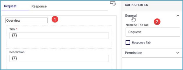
- To rename a tab, click on the tab name as displayed in the figure.
- This action will open the tab properties on the right-hand side of the screen, where you can enter a new name for the tab in the “Name of the Tab” box, and it will update the tab name accordingly.
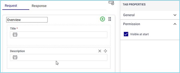
We can also make it visible at the start by marking the checkbox “Visible a t start” under the Tabs Permissions
Sections
Each tab can contain multiple sections filled with different components that are specific to the requirements of the application.
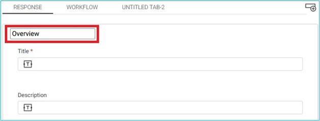
For instance, when we access the Forms tab, it will display two default tabs, “Response” and “Workflow”. Under the “Response” tab, the first section is typically named “Overview” and can be renamed by double clicking on the box which reads Overview.
Adding new Section:
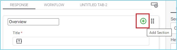
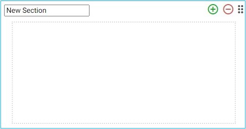
If we hover the mouse pointer next to the name of a section, a green plus icon will appear (as shown in the previous screen), which we can click to add a new, blank section below the current one.
When we move the mouse cursor over the name of a section, a green plus icon will be displayed (as shown in the previous screen). By clicking on this icon, a new empty section will be added below the current section.
Section properties:
When you click on a section, it will reveal a list of properties on the right-hand side of the page. These properties include categories like General, Appearance, and Permission.
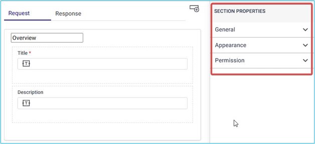
General the General property of a Section consists of two fields:
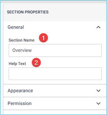
Section Name: This field allows you to specify a name or label for the section. It helps users quickly identify the purpose or content of the section.
Help Text Field: The help text field provides additional information or guidance related to the section. It’s a place where you can include instructions, tips, or explanations to assist users in understanding how to use or interact with the section effectively.
Appearance
Within this property, there is a field called “Display in columns”. In this setting, you have three options represented by 3 icons:
- One Column: This option displays the section content in a single column layout. It’s useful when you want a straightforward, linear presentation of information.
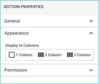
Two Columns: Choosing this option arranges the section content into a two-column format. It’s suitable for scenarios where you need to organize related details side by side.
Three Columns: If you select this option, the section content will be divided into three columns. This layout is helpful when you have multiple pieces of information to present simultaneously.
Permission
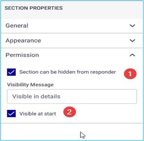
- Section Can Be Hidden from Responder: When you check this box, it allows the section to be hidden from the responder’s view. This can be useful for sensitive information or when certain details are not relevant to the responder. For example, if you’re collecting personal data but don’t want the responder to see it, you can enable this option. Now, when you mark the “Section Can Be Hidden from Responder” checkbox, an additional field called Visibility Message will automatically appear. In this field, you can write a custom message that will be displayed to the responder when the section is hidden. This message can provide context or instructions, explaining why the section is not visible.
- Visible at Start: By selecting this option, the section will be visible to the responder when they first access the form or page. It ensures that the section’s content is immediately available without any additional interaction. So, when configuring a section, you’ll define its name and provide helpful context through the help text field. This ensures a clear and user-friendly experience for anyone interacting with the section.
After adding all the necessary tabs, sections, and components along with their respective descriptions and details, the user can view a preview of the form by selecting the Preview option situated in the lower-right corner of the page.
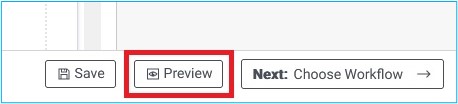
When preview is selected, it will show a comprehensive view of the application form, the way it will appear to the end user.
To illustrate in simple way, in our case we have added one tab namely “Tab 1” and one section namely “Section 1”. Under the section we have dropped two single line input namely “Title 1” and Description.
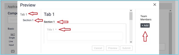
We can we also add Team Members By clicking on + Add section.