The Text component is used to collect textual information from the user. It presents a text box where the user can enter their desired text. The component also provides a toolbar with various formatting options to enhance the text input.
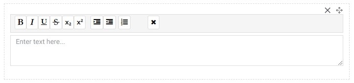
The toolbar includes the following tools: Bold: Allows you to apply bold formatting to the selected text.
Italic: Enables the use of italicized formatting for the selected text.
Underline: Adds an underline to the selected text.
Strikethrough: Applies a strikethrough style to the selected text.
Subscript: Formats the selected text as a subscript.
Superscript: Formats the selected text as a superscript.
Indent: Increases the indentation level of the selected text or paragraph.
Outdent: Decreases the indentation level of the selected text or paragraph.
Numbers: Converts the selected text or paragraph into a numbered list.
Clear Formatting: Removes any applied formatting from the selected text.
With these formatting options, users can customize their text according to their preferences or requirements.
Advance Properties of Text:
In the Advanced properties of the Text component, there is one option available:
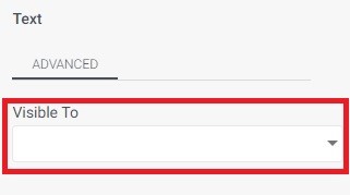
Visible to: This option allows you to specify who can see the Text component. By selecting certain individuals or groups, you can make the Text component visible only to them, while others will not be able to see it.
This feature provides control over the visibility of the Text component based on specific user permissions or roles. It allows you to customize the viewing access and ensure that the text input is visible only to the intended audience.