The Terms and Conditions widget is a component designed to facilitate the inclusion of specific terms and conditions within applications. This component used to ensure legal compliance and to establish clear guidelines and expectations for users interacting with the application. The process of integrating this feature into applications is made effortless for administrators as it is a simple drag-and-drop functionality in the form builder.
Basic Properties of Terms and Conditions component:
In the Basic properties of the Terms and conditions component, you will find the following options:
- Required Checkbox: This checkbox allows you to specify whether the acceptance of terms and conditions is mandatory for users. By selecting this checkbox, users will be required to agree to the terms and conditions before submitting the form.
- Label: In this field, you can provide the label or title for the terms and conditions. It allows you to customize the text that will be displayed alongside the checkbox.
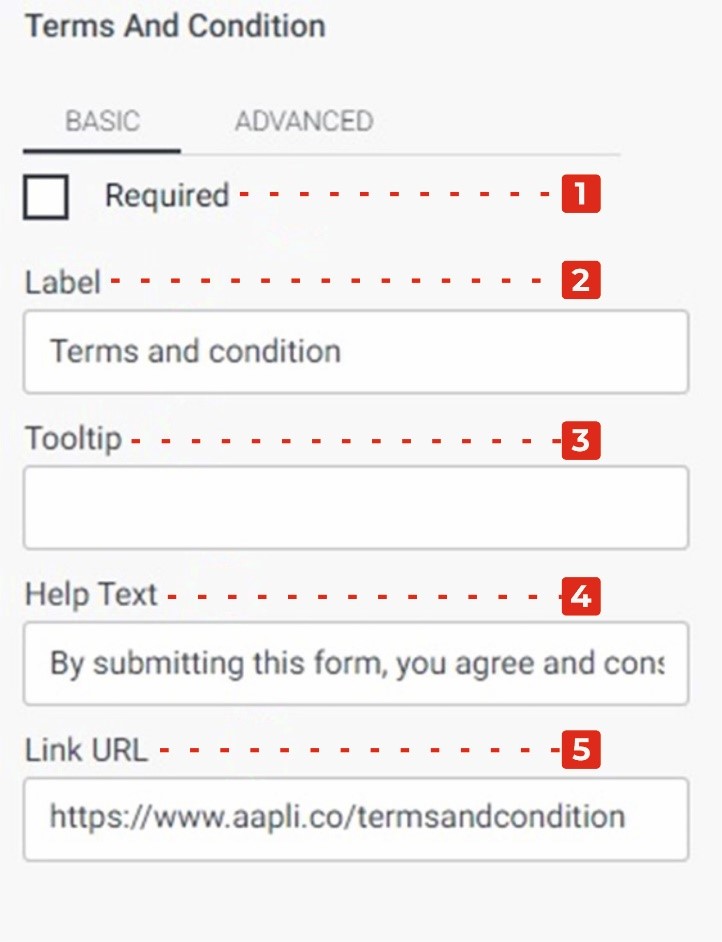
- Tool Tip: The Tool Tip field enables you to add additional information or guidance regarding the terms and conditions. This tooltip text will be displayed when users hover over the terms and conditions field.
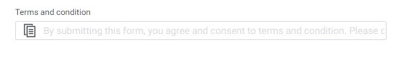
- Tagline: Here, you can enter a tagline or a brief statement that provides an example or summary of the terms and conditions. It can serve as a prompt for users to read and agree to the terms. For instance, you can include a message like “By submitting this form, you agree and consent to the terms and conditions. Please click here to read more.”
- Link URL: This field allows administrators to provide a URL link to the full terms and conditions document. By entering the appropriate link, users can access and review the complete terms and conditions before agreeing to them.
Advanced Properties of Terms and Conditions component:
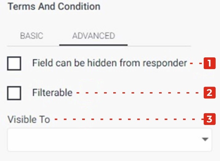
Field can be hidden from the responder: This checkbox allows you to control the visibility of the terms and conditions field for the form responder. By selecting this checkbox, the field will be hidden from the responder’s view, providing an option to hide the terms and conditions if necessary.
Filtrate: This checkbox enables you to apply filtration or filtering functionality to the terms and conditions field. When selected, you can configure additional settings to filter or restrict the display of the terms and conditions based on certain conditions or criteria.
Visible to: This dropdown allows you to specify the audience or individuals for whom the drop-down input associated with the terms and conditions will be visible. By selecting specific persons from the dropdown, you can ensure that the drop-down input is only visible to those selected individuals. This provides a way to control who can see and interact with the terms and conditions input field.