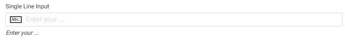
The initial component listed in the Form Building Components panel is the Single Line Input. Single line input is used when collecting information limited to a single line. This component can be easily selected, moved, and placed within the form builder by performing a simple click, drag, and drop action.
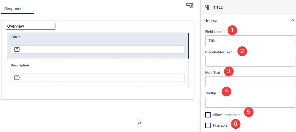
Once you have placed a Single Line Input component within the form builder, you can click on it to access its properties on the right-hand side of the page. In the properties section, you have the flexibility to customize the Single Line Input according to your specific requirements. The properties of the Single line input can be found on the right-hand side of the page. The properties are divided into General
Properties of Single Line Input:
The properties of the Single line input is divided into General, Condition, Appearance, Validation, Permission.
General
Field Label The Field Label is the name or title that appears on to the input field in the form, helping users understand what information they are required to enter. It provides a clear and concise description of the expected data, such as “Title”, “First Name” “Email Address” etc.
Placeholder Text Placeholder text is the temporary text that appears inside the input field before any information is entered. It serves as a hint for the user, suggesting what should be typed into the field. For instance, a placeholder text might say “Enter your name” in a field labeled “Name” or “example@domain.com” for an email field, giving the user a clear idea of the expected input format.
Help Text Help text provides additional guidance or instructions to the user about the input field and appears beneath it. This text offers further clarification to assist the user in filling out the field correctly. For example, under a “Name” field, help text might read “Please enter your full legal name as it appears on your ID.”
Tooltip A tooltip is a brief informational message that appears when the user hovers over the input field. It provides extra context or instructions in a compact manner. For instance, hovering over a password field might show a tooltip saying “Your password must be at least 8 characters long and include a special character.”
Allow Attachment (Checkbox) When the “Allow Attachment” option is enabled, users can attach files directly to this input field. This feature is useful in scenarios where additional documentation or files, such as resumes, certificates, or images, need to be submitted along with the input.
Filterable (Checkbox) If the “Filterable” option is checked, this input field can be used as a filter criterion in data tables or reports. This means that users can later search or filter records based on the value entered in this field, making it useful for creating dynamic filtering options in lists or dashboards.
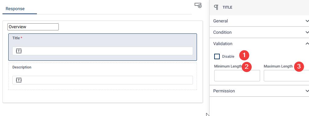
Validation
- Disable Checkbox: Make the single-line input an essential field by ticking the “Required” checkbox, prompting users to provide necessary information.
- Min and Max Length: Define the acceptable length range for the input, by providing the minimum and maximum input range.
Permission Visible to: This is a dropdown with list of Roles. We can click on Visible to drop down and select list of Roles who can view the Single line input. This can be useful in examples such as when you want to collect certain data from moderator without displaying the field to the ideator.
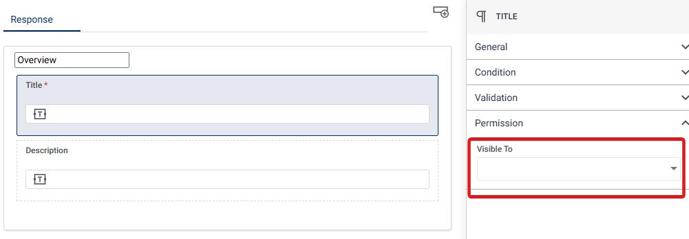
We can also click on Visible to drop down and select list of people who can view the Single line input.