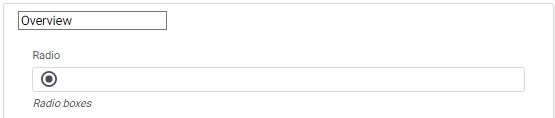
A radio component is a user interface element commonly used in form builders. It allows users to select a single option from a list of predefined choices. The radio component typically consists of a round or circular button, also known as a radio button, alongside each option. When the user selects one option, it automatically deselects any previously selected option, ensuring that only one choice is selected at a time.
Radio properties are divided into basics and Advanced properties.
Basic Properties of Radio:
Within the Basic tab of the Radio properties, you will find the following options:
- Required Checkbox: By enabling this checkbox, you can make the Radio component a mandatory selection, ensuring that users must choose one option before submitting the form.
- Label: This property allows you to provide a descriptive label or caption for the Radio component, indicating the purpose or context of the available options.
- Help Text: You can add additional explanatory text in the Help Text property, providing guidance or instructions to users regarding the available options or any specific information they need to consider while making their selection.
- Tag Line: The Tag Line property enables you to add a small line of text below the Radio component, which can be used to provide further instructions or additional context related to the available options.
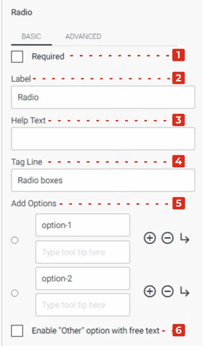
- Add Options: By clicking the “+” logo, you can dynamically add more options to the Radio component. Additionally, the arrow logo allows you to add sub-options under specific options, and the “-“ logo allows you to remove options as needed.
- Enable “Other” Option with Free Text Checkbox: Enabling this checkbox adds an “Other” option to the Radio component, allowing users to input their own custom response in a free text format if none of the provided options meet their needs.
Advanced Properties of Radio
In the Advanced tab of the Radio properties, you will find two additional checkboxes and a dropdown menu:
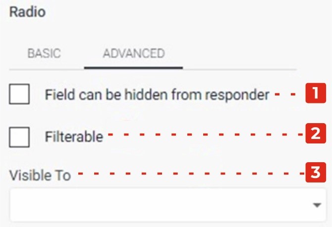
- Field Can Be Hidden from the Responder: Enabling this checkbox allows you to hide the Radio component from the form responder or user. This can be useful when you want to collect certain data without displaying the field visibly. It allows you to gather information in the background or based on specific conditions.
- Filtrate Checkbox: By selecting this checkbox, you enable the “filtrate” feature for the Radio component. Filtrate refers to the capability of the input field to act as a filter or search parameter for data. This allows users to input values that can be used to filter or narrow down results in a connected system or database.
- Visible to Dropdown: The Visible to dropdown allows you to specify which individuals or groups the Radio component should be visible to. By selecting specific persons or groups from the dropdown, you can restrict the visibility of the field to only those selected individuals.