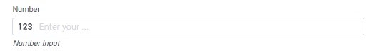
The Number component is used in forms to collect numerical input from users. It provides a field where users can enter numeric values such as integers or decimals, allowing for precise and quantitative data input.
Basic Properties of numbers
Within the Basic tab of the Number properties, you will find the following options:
- Required Checkbox: Enabling this checkbox makes the Number field a mandatory input, ensuring that users must provide a numerical value before submitting the form.
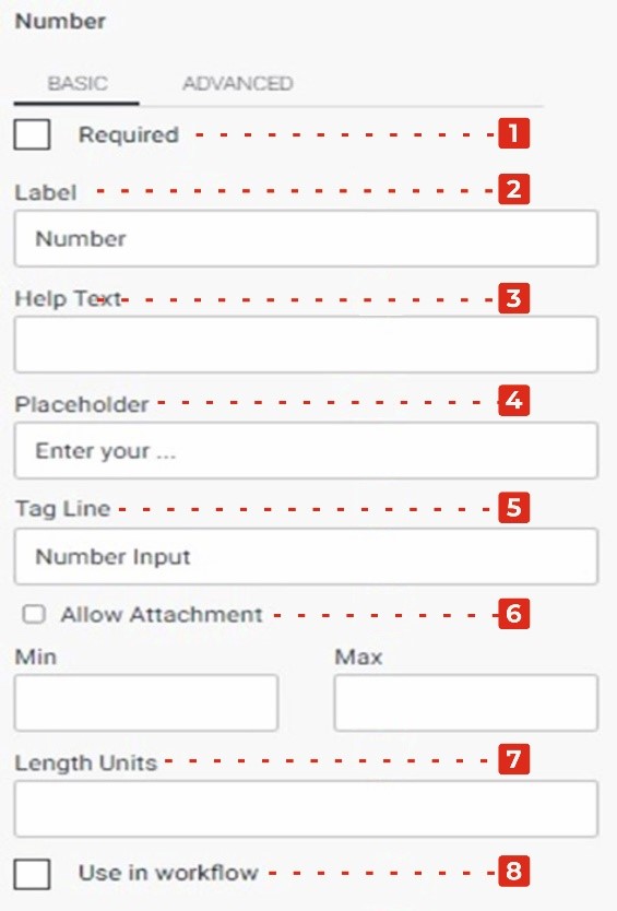
- Label: This property allows you to provide a descriptive label or caption for the Number field, indicating the purpose or context of the numerical input.
- Help Text: You can add additional explanatory text in the Help Text property, providing guidance or instructions to users regarding the expected format or specific information related to the numerical input.
- Placeholder: The Placeholder property allows you to display a temporary hint or example inside the Number field, providing users with a visual cue or suggestion for the type of value to enter.
- Tag Line: The Tag Line property enables you to add a small line of text below the Number field, which can be used to provide further instructions or additional context related to the numerical input.
- Allow Attachment Checkbox: Enabling this checkbox allows users to attach files or additional information related to the Number input. This can be useful when there is a need to provide supporting documents or evidence alongside the numerical value.
- Length Units: This property allows you to specify the units of measurement or length associated with the Number field, if applicable. It helps users understand the unit of measurement expected for the numerical input.
- Use in Workflow Checkbox: Enabling this checkbox indicates that the entered numerical value from the Number field should be used in the form’s workflow or further processes.
Advanced Properties of Number
In the Advanced tab of the Number properties, you will find two additional checkboxes and a dropdown menu:
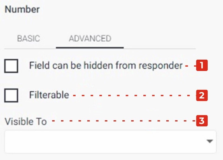
- Field Can Be Hidden from the Responder: Enabling this checkbox allows you to hide the Number field from the form responder or user. This can be useful when you want to collect numerical data without displaying the field visibly. It allows you to gather information in the background or based on specific conditions.
- Filtrate Checkbox: By selecting this checkbox, you enable the “filtrate” feature for the Number field. Filtrate refers to the capability of the input field to act as a filter or search parameter for data. This allows users to input values that can be used to filter or narrow down results in a connected system or database.
- Visible to Dropdown: The Visible to dropdown allows you to specify which individuals or groups the Number field should be visible to. By selecting specific persons or groups from the dropdown, you can restrict the visibility of the field to only those selected individuals.