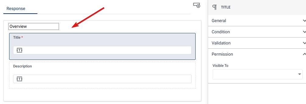
Multi Line Input is a form component that allows users to enter and submit text or information in a larger text area. It provides a space for users to input multiple lines of text, such as comments, descriptions, or longer responses.
Properties of Multi Line Input
General
- Field Label: The Field Label is the descriptive title displayed next to the input area, helping users understand what kind of information is expected. It should clearly define the type of input needed, such as “Comments” or “Detailed Description.”
- Placeholder: Text Placeholder Text is the default gray text that appears inside the multi-line input box, offering a brief example or hint about what to enter. Once the user begins typing, this text disappears. It’s useful for providing context, like “Enter your feedback here.”
- Help Text: Help Text provides additional guidance beneath or near the multi-line input box, offering more detailed instructions on how to fill out the field. It helps users understand the specific format or content needed, such as “Please provide a detailed description of the issue.”
- Tooltip: A Tooltip is a brief explanatory text that appears when the user hovers over an icon or the input area. It provides additional clarification or tips about the input field in a non-intrusive manner. For example, “Please limit your description to 500 words.”
- Allow Attachment: The “Allow Attachment” checkbox enables the option for users to upload files or documents alongside their text input. This is useful when additional supporting materials, such as images or PDFs, are needed to complement the information entered in the text field.
- Filterable The “Filterable” checkbox allows the data entered in the multi-line input field to be used for filtering or sorting in reports or lists. This is particularly useful for fields where content may need to be searched or organized, like “Comments” or “Feedback.”
Condition
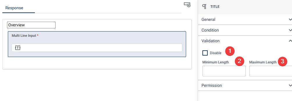
- Disable (Checkbox): The “Disable” checkbox allows the field to be disabled, preventing users from entering any data in the multi-line input field. When selected, the input area becomes non-editable, which can be useful in scenarios where the field is conditionally required or not applicable in certain contexts.
- Minimum Length: The “Minimum Length” field specifies the minimum number of characters that must be entered in the multi-line input field. This ensures that users provide a sufficient amount of information, especially in cases where brief or incomplete responses might not be acceptable. For example, setting a minimum length of 50 characters would require users to write at least 50 characters before submitting the form.
- Maximum Length: The “Maximum Length” field sets the upper limit on the number of characters that can be entered in the multi-line input field. This is useful for restricting lengthy responses and ensuring that the input does not exceed a certain limit. For example, setting a maximum length of 500 characters would limit the user’s response to 500 characters.workflow processes.
Permission
Visible To (Dropdown)
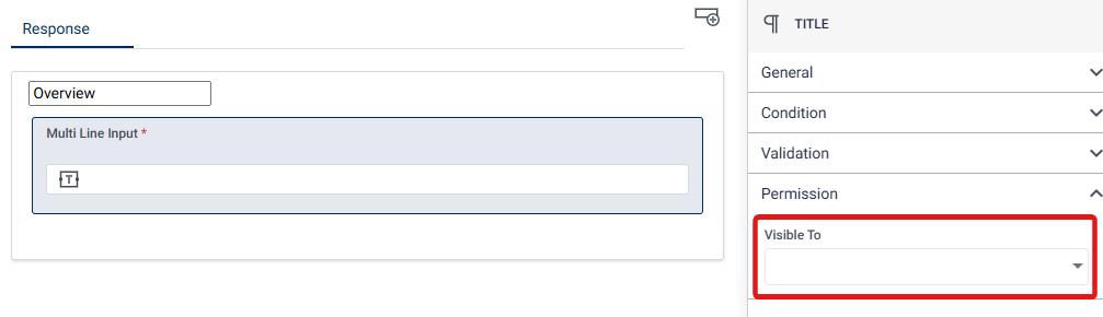
The “Visible To” dropdown allows you to control which roles have access to view the multi-line input field. This dropdown contains a list of predefined roles, and selecting one or more roles will restrict visibility of the field to users with those specific roles. It helps in ensuring that sensitive information is only accessible to authorized users, such as admins, managers, or specific team members, based on their role within the platform.