The Multi Choice component allows users to select one or more options from a predefined list. It provides a set of choices or options for users to choose from, enabling them to make selections based on their preferences, opinions, or specific requirements. This component is commonly used when gathering multiple-choice responses, conducting surveys, or collecting data that involves selecting one or more options from a given list.

Multi Choice properties are divided into basics and Advanced properties.
Properties of Multi Choice: The Multi-Choice input features are categorized into General, Condition, Appearance, Validation, Permission, and Option Source.
General

- Field Label: Give your multi-choice selection a clear and descriptive label, guiding users on what to choose.
- Help Text: Provide additional assistance or concise information to clarify aspects of the multi-choice input.
- Tooltip: Enhance user interaction by providing quick tips or additional context with tooltips when they hover over the dropdown. In the General section, you’ll also find checkboxes:
- Enable Duplicate: Choose whether to allow or disallow the entry of identical values in the multi-choice for a more streamlined data collection.
- Index Number: This automatically appears when enabling duplicate entries, aiding in sorting and referencing.
- Allow Attachment: Enable users to attach files within the dropdown for added versatility.
- Filterable: Improve sorting and the user experience through indexing and filtering.
Condition
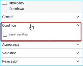
Select the “Use in Workflow” checkbox to integrate the multi-choice input into workflow processes.
Appearance
Basic Properties of Multi Choice:
In the Basic properties of the Multi Choice component, you will find the following options:
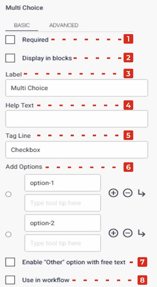
- Required Checkbox: Enabling this checkbox makes the Multi Choice field a mandatory selection, ensuring that users must choose at least one option before submitting the form.
- Display in Blocks Checkbox: Enabling this checkbox arranges the options in a block-style format, displaying each option on a separate line or in a visually distinct manner, enhancing readability and user experience.
- Label: This property allows you to provide a descriptive label or question for the Multi Choice field, indicating the purpose or topic of the selection.
- Help Text: You can add additional explanatory text in the Help Text property, providing guidance or instructions to users regarding the available choices or any specific details they need to consider while making their selection.
- Tag Line: The Tag Line property enables you to add a small line of text below the Multi Choice field, which can be used to provide further instructions or additional context related to the options.
- Add Options: By clicking the “+” icon, you can add more options to the Multi Choice field. Additionally, the arrow icon allows you to add sub-options or hierarchical choices, while the “-“ icon removes options if needed.
- Enable “Other” Option with Free Text Checkbox: Enabling this checkbox provides an additional “Other” option alongside the predefined choices, allowing users to input a custom response if none of the listed options fit their selection.
- Use in Workflow Checkbox: Enabling this checkbox includes the Multi Choice field in the workflow process.
Advanced Properties of Multi Choice:
In the Advanced tab of the Multi Choice component properties, you will find the following options:
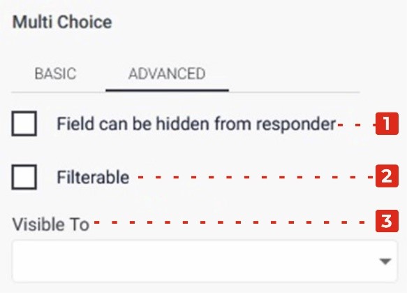
Field Can Be Hidden from the Responder: Enabling this checkbox allows you to hide the Multi Choice field from the form responder or user. This can be useful when you want to collect the selection without displaying the field visibly.
Filtrate Checkbox: By selecting this checkbox, you enable the “filtrate” feature for the Multi Choice field. Filtrate refers to the capability of the input field to act as a filter or search parameter for data. This allows users to select options that can be used to filter or narrow down results in a connected system or database.
Visible to Dropdown: The Visible to dropdown allows you to specify which individuals or groups the Multi Choice field should be visible to. By selecting specific persons or groups from the dropdown, you can restrict the visibility of the field to only those selected individuals.