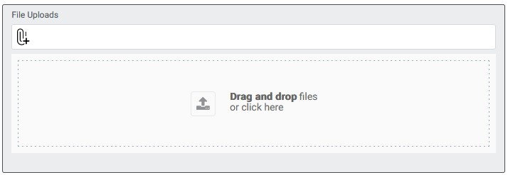
The File Upload component allows users to upload files by either dragging and dropping them onto the designated area or clicking to browse and select files from their device. It provides a convenient way for users to submit files, such as documents, images, or media, as part of a form.
Basic Properties of File uploads:
In the Basic tab of the File Upload properties, you will find the following options:
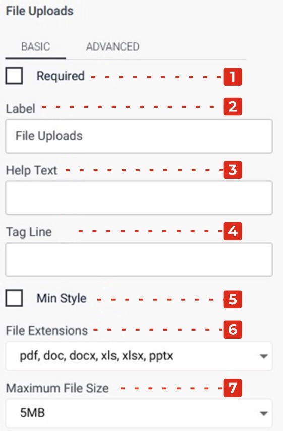
Required Checkbox: Enabling this checkbox makes the File Upload field a mandatory input, ensuring that users must upload a file before submitting the form.
Label: This property allows you to provide a descriptive label or caption for the File Upload field, indicating the purpose or expected content of the uploaded file.
Help Text: You can add additional explanatory text in the Help Text property, providing guidance or instructions to users regarding the accepted file types, file size limits, or any other relevant information.
Tag Line: The Tag Line property enables you to add a small line of text below the File Upload field, which can be used to provide further instructions or additional context related to the file upload. 5.Min Style Checkbox: Enabling this checkbox applies a minimalistic style to the File Upload field, providing a more streamlined appearance.
File Extension Dropdown: This dropdown allows you to specify the allowed file extensions. By selecting the checkboxes next to the desired file extensions, you can restrict file uploads to specific formats such as PDF, DOC, DOCX, XLS, PPTX, and more.
Maximum File Size Dropdown: This dropdown menu allows you to set the maximum file size limit for uploads. By clicking on the checkboxes next to the desired file sizes, you can define the acceptable file sizes, typically ranging from 1 MB to 10 MB.
Advanced Properties of File uploads:
In the Advanced tab of the File Upload properties, you will find the following options:
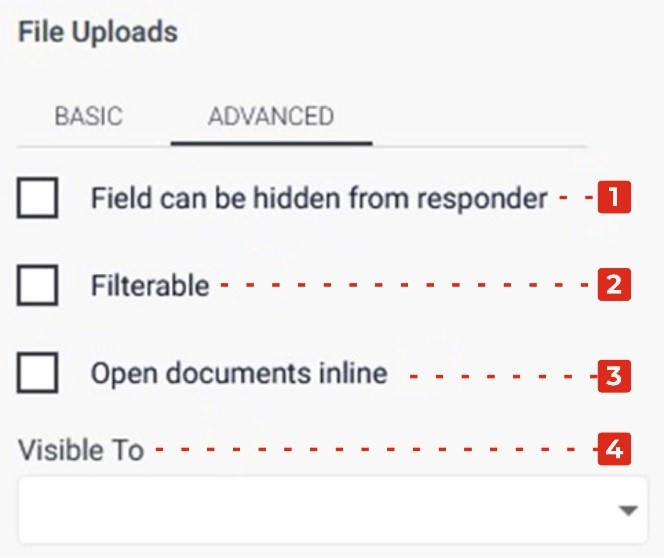
Field Can Be Hidden from the Responder: Enabling this checkbox allows you to hide the File Upload field from the form responder or user. This can be useful when you want to collect file uploads without displaying the field visibly.
Filtrate Checkbox: By selecting this checkbox, you enable the “filtrate” feature for the File Upload field. Filtrate refers to the capability of the input field to act as a filter or search parameter for data. This allows users to upload files that can be used to filter or narrow down results in a connected system or database.
Open Documents Inline Checkbox: Enabling this checkbox allows documents uploaded through the File Upload field to be opened and displayed inline, within the form or application, rather than requiring a separate download or external application to view them.
Visible to Dropdown: The Visible to dropdown allows you to specify which individuals or groups the File Upload field should be visible to. By selecting specific persons or groups from the dropdown, you can restrict the visibility of the field to only those selected individuals.