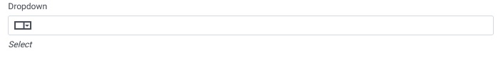
The Drop-Down component is used in forms to present users with a list of selectable options, allowing them to choose a single value from the provided options. It provides a dropdown menu interface, conserving space while offering a convenient and structured way for users to make selections.
Properties of Drop Down: The properties of the Dropdown input is divided into General, Condition, Appearance, Validation, Permission and Option Source.
General
The General Properties section allows users to configure foundational aspects of the dropdown component. Upon expanding this section, users see the following options:
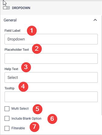
- Field Label: The name of the dropdown field as it appears to the end-user. For example, “Select Country”.
- Placeholder Text: Text displayed inside the dropdown when no option is selected, guiding the user on what to do (e.g., “Choose an option”).
- Help Text: Additional descriptive information displayed below the dropdown, providing guidance on its usage.
- Tooltip: A brief hint or description that appears when the user hovers over the dropdown field.
- Multi-Select: A checkbox enabling users to select multiple options simultaneously from the dropdown.
- Include Blank Option: Allows adding a blank option at the top of the dropdown, giving users the ability to deselect or leave the field empty.
- Filterable: Enables a search bar within the dropdown, allowing users to filter options dynamically.
Appearance
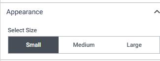
The Appearance Properties section focuses on the visual dimensions of the dropdown. Upon expanding this section, users can choose from the following predefined sizes: • Small • Medium • Large This helps align the dropdown with the overall layout and design of the application.
Validation
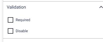
The Validation Properties section helps enforce rules for user inputs. The options available are:
- Required: Ensures the field cannot be left empty, forcing the user to select an option.
- Disabled: Makes the dropdown field non-editable, displaying it in a greyed-out state.
Permission
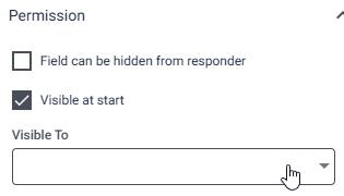
The Permission Properties section manages visibility and accessibility of the dropdown based on user roles and conditions. Options include:
- Field Can Be Hidden from Responder: Hides the dropdown field from the user filling out the form but keeps it accessible in the backend.
- Visible at Start: Ensures the dropdown is visible when the form loads.
- Visible To: Displays a list of roles (e.g., Admin, Manager, Employee) from which users can individually select who can see the dropdown. This ensures the dropdown is visible only to the designated roles.
Option Source Properties The Option Source Properties section defines the source of options displayed in the dropdown. Two configurations are available:

- Select Option: A dropdown populated with dynamic options derived from user properties such as Emp ID, Country, Gender, and Department. The data source is linked to existing user data fields.
- Static Option: Users manually type the options they wish to display in the dropdown. Key features include: Text fields for entering individual options. o A “+” icon to add new options. o A “- icon to delete existing options. This flexibility allows dropdown options to be either dynamically populated from existing datasets or statically defined by the form creator.