The Date component is used in forms to collect date input from users. It provides a field where users can enter or select a date, typically in the mm/dd/yyyy format, allowing for accurate and standardized recording of dates for various purposes such as event registration, appointment scheduling, or birthdate submission.

Basic Properties of Date
Within the Basic tab of the Date properties, you will find the following options:
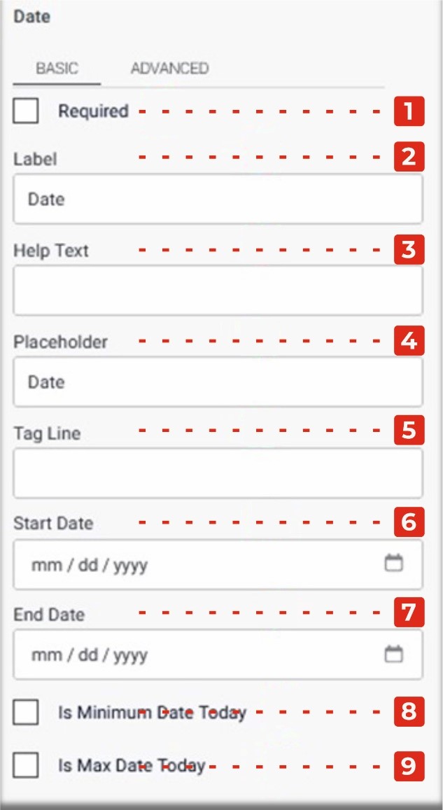
- Required Checkbox: Enabling this checkbox makes the Date field a mandatory input, ensuring that users must provide a date before submitting the form.
- Label: This property allows you to provide a descriptive label or caption for the Date field, indicating the purpose or context of the date input.
- Help Text: You can add additional explanatory text in the Help Text property, providing guidance or instructions to users regarding the expected date format or any specific information related to the date input.
- Placeholder: The Placeholder property allows you to display a temporary hint or example inside the Date field, providing users with a visual cue or suggestion for the desired date format.
- Tag Line: The Tag Line property enables you to add a small line of text below the Date field, which can be used to provide further instructions or additional context related to the date input.
- Start Date: This property allows you to specify the minimum or earliest date that can be selected in the Date field, typically in the dd/mm/yyyy format.
- End Date: This property allows you to specify the maximum or latest date that can be selected in the Date field, also in the dd/mm/yyyy format.
- Is Minimum Date Today Checkbox: Enabling this checkbox automatically sets the minimum date as today’s date. Users will only be able to select a date on or after the current day.
- Is Maximum Date Today Checkbox: Enabling this checkbox automatically sets the maximum date as today’s date. Users will only be able to select a date on or before the current day.
Advanced Properties of Date
In the Advanced tab of the Date properties, you will find two additional checkboxes and a dropdown menu:
Within the Basic tab of the Date properties, you will find the following options:
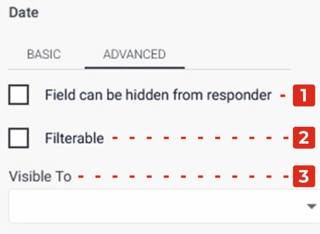
Field Can Be Hidden from the Responder: Enabling this checkbox allows you to hide the Date field from the form responder or user. This can be useful when you want to collect date data without displaying the field visibly. It allows you to gather information in the background or based on specific conditions.
Filtrate Checkbox: By selecting this checkbox, you enable the “filtrate” feature for the Date field. Filtrate refers to the capability of the input field to act as a filter or search parameter for data. This allows users to input dates that can be used to filter or narrow down results in a connected system or database.
Visible to Dropdown: The Visible to dropdown allows you to specify which individuals or groups the Date field should be visible to. By selecting specific persons or groups from the dropdown, you can restrict the visibility of the field to only those selected individuals.